Mastering UX Design for Nonprofits: A Guide for Management Executives
Introduction
In the nonprofit world, your website is often the first point of contact for donors, volunteers, and those in need of your services. As such, it’s crucial that this digital gateway offers an exceptional User Experience (UX). This short guide aims to educate management executives on the importance of UX design for nonprofits, providing real-world examples and actionable tips for improvement.
Why UX Design for Nonprofits is Crucial
UX design for nonprofits is more than just a trending topic in the tech industry; it’s a vital component that can significantly impact your organization’s digital footprint. A well-designed website can serve as a powerful tool for donor engagement, volunteer recruitment, and overall mission effectiveness. Conversely, a poorly designed website can deter potential supporters and create barriers to your organization’s success.
Real-world Examples of Effective UX Design for Nonprofits
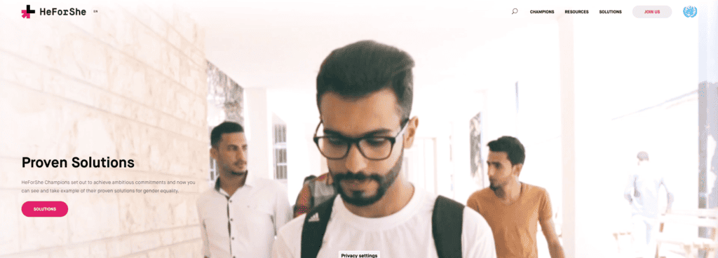
HeForShe
Managed by UN Women, the HeForShe initiative exemplifies effective UX design for nonprofits. Their clean, straightforward design makes it easy for visitors to understand their mission and take action, whether that’s donating or getting involved in other ways.
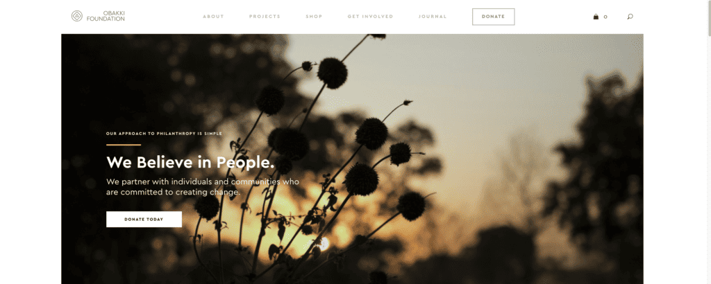
The Obakki Foundation
This foundation focuses on providing clean water and education in Africa. Their website is not just visually appealing but also offers an intuitive user journey, making it easier for visitors to donate or become volunteers.
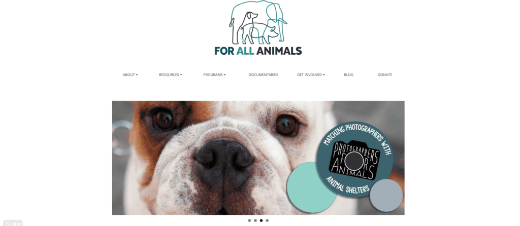
For All Animals
Specializing in animal welfare, For All Animals provides a seamless online experience for those looking to adopt pets or donate. Their website is easy to navigate, with clear calls to action and compelling visuals.
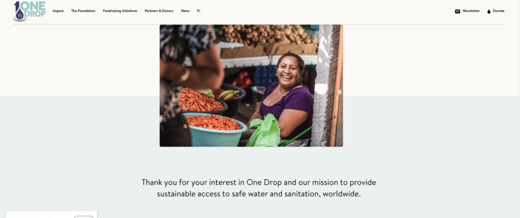
ONE DROP
ONE DROP focuses on water conservation and offers a stellar example of how effective UX design for nonprofits can make complex issues easily understandable. Their website is both visually compelling and user-friendly.
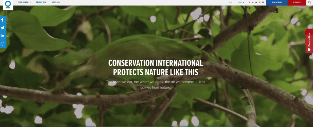
Conservation International
Conservation International’s website uses compelling visuals and an intuitive layout to guide visitors through their conservation efforts and how one can contribute. It’s an excellent example of how effective UX design can be for nonprofits.
Key Considerations for Management Executives
- User Research: Understanding your audience’s needs and preferences is the first step in effective UX design for nonprofits. Use surveys, interviews, or analytics tools to gather this crucial information.
- Information Architecture: A well-organized website can significantly improve the user experience. Make sure your site’s content is logically structured.
- Visual Design: Consistency is key in UX design for nonprofits. Use a consistent branding strategy and an appealing color scheme to make your website visually engaging.
- Usability Testing: Regular usability tests can help identify areas for improvement, ensuring that your website remains user-friendly.
- Accessibility: Making your website accessible to people with disabilities not only broadens your audience but is often a legal requirement.
Conclusion
Investing in UX design for nonprofits is not just a luxury; it’s a strategic necessity. A well-designed website can significantly improve user engagement and has a direct impact on fundraising efforts. By understanding and implementing the principles of good UX design, management executives can turn their organization’s website into a powerful tool for change.


