Web Designs For Online Courses
Web Designs for online Courses, Coaches and Schools
When creating a website for an online course, there are a few things to keep in mind. You want the course to be user-friendly but also visually appealing.
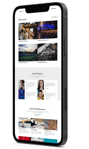
There are many ways to accomplish this, including using a lot of white space to make the course content more readable. The use of numerous images or videos depicting the course material in action is another option. This can be accomplished by displaying the material to the students or by just displaying the content that is currently being used. Viewers can see what they can expect from the lesson by watching this. It’s important to have images of the coach in action when developing a coach website, whether they’re coaching or speaking at an educational event.
Testimonials from students who have completed the course are another way to enhance the appeal of an online course. It’s possible to put them on the front page, or disperse them around the site, to provide students more information about what they’ve learnt. Customers and students for your online course will see what others thought of it if you employ this method of advertising.
A few things to keep in mind
Successful web designs for online courses is an ever-evolving process. It’s also important to focus on the features that are most important to your specific audience. At Digismart, we won’t just build you a great coaching website, we’ll help build your whole online business, with our integrated CRM.
To get started, check out web designs for online courses below:

