Donation Page Optimization: The Key to Boosting Nonprofit Contributions
In today’s digital-centric fundraising landscape, donation page optimization stands out as an essential part of a good digital strategy for nonprofits. The donation page, often the culmination of a potential donor’s journey, can either make or break the decision to contribute. Many nonprofits grapple with low conversion rates, deterring potential donors due to factors like a convoluted donation process or a lack of trust elements. By focusing on donation page optimization, these challenges can be directly addressed, ensuring that no potential contribution slips through the cracks.
Why Donation Page Optimization Matters
Optimizing your donation page isn’t just about aesthetics; it’s a strategic move to enhance conversion rates, leading to increased funding for your mission. A well-optimized page provides a seamless, trustworthy, and persuasive experience for potential donors.
Essential Steps for Donation Page Optimization:
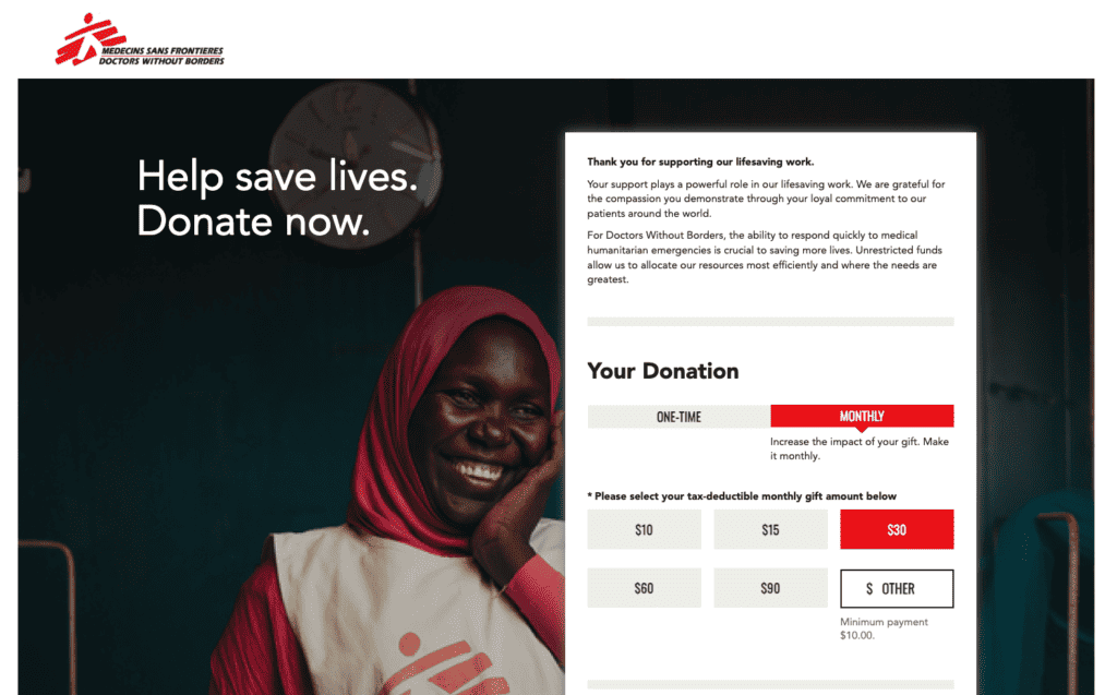
Prioritize Simplicity: Avoid overwhelming visitors with excessive options or information. A clean design with a distinct call-to-action is crucial. The donation process should be concise, ideally limited to 3 steps or fewer. Example: Doctors Without Borders showcases donation page optimization by offering a clear, distraction-free page, simplifying the donation experience.
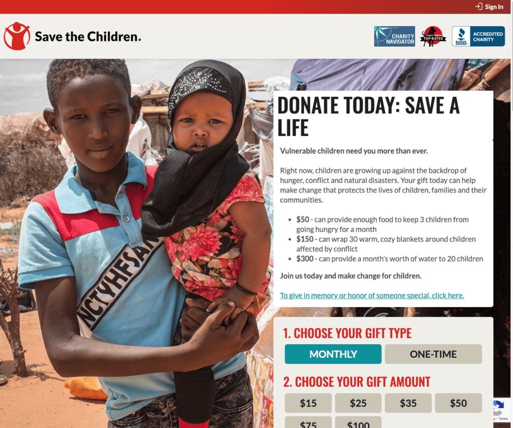
Ensure Mobile Responsiveness: A significant portion of users will access your page via mobile devices. Guarantee that your donation page is mobile-optimized with a responsive design and user-friendly interface. Example: Save the Children exemplifies donation page optimization for mobile users, ensuring a smooth donation process across all devices.
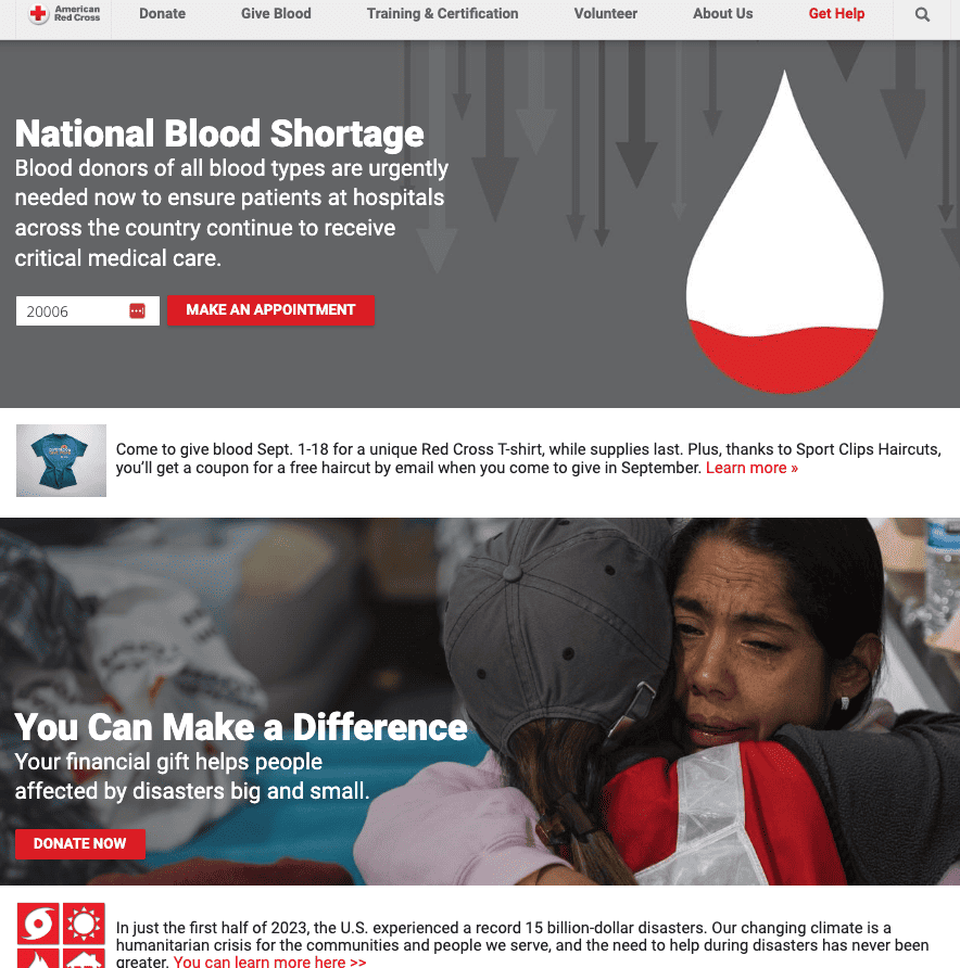
Incorporate Trust Elements: Display trust badges, user testimonials, and security certifications. These components can significantly bolster donor confidence regarding the security of their personal and financial details. Example: The Red Cross prominently features security certifications and donor testimonials, reinforcing trust in the donation process.
Promote Recurring Donations: Facilitate options for both one-time and recurring contributions. Catering to both preferences can maximize donor engagement and support.
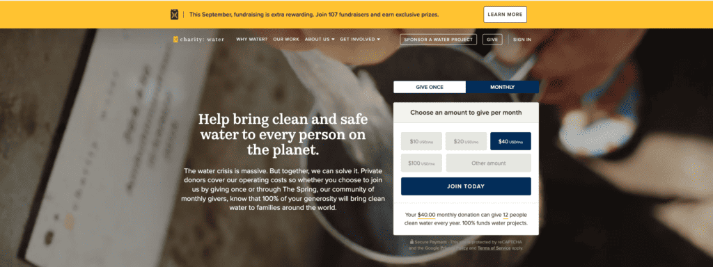
Highlight Transparency: Clearly articulate how donations will be allocated. Donors are more inclined to give when they understand the direct impact of their contribution. Example: Charity: Water offers a detailed breakdown of fund allocation, emphasizing the tangible benefits of each donation.
Streamline Donation Forms: Minimize the number of required fields in the donation form. Request only essential information to expedite the donation process.
Leverage Engaging Content: Incorporate compelling narratives and impactful visuals that resonate with potential donors. A poignant story or image can be the catalyst for a donation. Example: UNICEF employs evocative imagery and narratives, underscoring the urgency and significance of each contribution.
The Tangible Benefits of Donation Page Optimization
By embracing these donation page optimization strategies, nonprofits can witness a notable uptick in their conversion rates. Beyond merely securing more donations, it’s about forging enduring bonds with donors. An optimized page conveys professionalism, reliability, and a genuine dedication to the cause.
Conclusion
In the realm of online fundraising, donation page optimization is a game-changer. It’s a proactive investment in your organization’s future, ensuring sustained funding to perpetuate your mission. With a strategic approach to donation page optimization, your nonprofit can transform casual visitors into steadfast supporters.

